Organization: Saratoga Automobile Museum
Role: Art Director/Designer
Deliverables: Event Identity, Invitation, Poster, Digital Ads, Email Marketing
Overview: Created the visual identity for the Saratoga Automobile Museum's annual wine tasting fundraiser, developing a cohesive campaign that connected the museum's automotive heritage with the event experience across print and digital media.
Challenge: Develop a distinctive event identity that celebrated both the museum's automotive roots and the social atmosphere of a wine tasting while creating a cohesive campaign that worked seamlessly across multiple touchpoints.
Approach: The creative concept was inspired by the layout of a racetrack, reimagined through the lens of a wine tasting experience. Familiar tasting terminology was integrated into the track's key sections, creating a subtle visual connection between the event and the museum. Supported by a fresh, energetic color palette, the identity carried consistently across oversized pit pass–style tickets, posters, postcards, digital advertising, email campaigns, and the event website.
Organization: Saratoga Automobile Museum
Role: Art Director, Exhibition Designer
Deliverables: Exhibition Identity, Environmental Graphics, Interpretive Panels, Vehicle Identification, Visitor Experience, Marketing Collateral, Web Assets
Overview: Designed the visual identity and exhibition graphics for a retrospective celebrating the life and career of Sam Posey. Far more than a racing exhibition, the show explored Posey's remarkable contributions as a professional race car driver, architect, artist, furniture designer, author, broadcaster, and lifelong creative thinker. The exhibition featured a collection of his personal automobiles alongside examples of his architecture, furniture, artwork, and internationally recognized model railroad.
Challenge: Create a visual identity that honored the many facets of Sam Posey's life while presenting a diverse collection of objects through a single, cohesive visitor experience. The exhibition needed to celebrate both his legendary racing career and the creativity that defined his life beyond motorsports.
Approach: The exhibition identity centered on an illustrated interpretation of Sam Posey's iconic racing helmet, transforming one of the most recognizable symbols of his career into the exhibition's signature mark. The color palette was inspired by Posey's distinctive No. 76 Dodge Challenger, using its vibrant chartreuse paired with soft blue-gray tones to establish a bold yet refined visual language. Throughout the exhibition, environmental graphics, interpretive panels, and vehicle identification labels combined storytelling with thoughtful typography to connect the many chapters of Posey's life. Every artifact, automobile, and display was carefully positioned to create an engaging visitor experience, with ADA accessibility, viewing distances, and visual hierarchy guiding the overall exhibition design.
Organization: Saratoga Automobile Museum
Role: Art Director/Designer
Deliverables: Publication Design, Copy Editing, Editorial Layout, Typography, Print Production
Overview: Created and developed Horsepower, transforming the Saratoga Automobile Museum's newsletter into a professionally designed magazine that became both a respected editorial publication and an important fundraising tool. Published quarterly for nearly a decade, the magazine celebrated automotive history, museum initiatives, and the people who share a passion for the automobile.
Challenge: Reimagine a traditional newsletter as a magazine-quality publication that would strengthen the museum's brand, engage readers through compelling editorial content, and create lasting value for members, supporters, and advertisers.
Approach: As creator, editor, publisher, and designer, I led every aspect of the publication from concept to completion. I established the editorial vision, commissioned and edited stories, art directed photography, collaborated with writers and partner organizations, and designed each issue from cover to cover. Through thoughtful typography, strong visual storytelling, and a cohesive editorial design system, Horsepower evolved into a publication that informed, inspired, and strengthened the museum's connection with its members and supporters.
Role: Art Director/Designer
Deliverables: Book Design, Typography, Photo Selection, Color Correction, Print Production
Overview: Designed a 120-page tourism book celebrating Saratoga Springs, transforming a completed manuscript into a professionally designed publication. As a Saratoga native, the opportunity to create a book about the community I call home made this project especially meaningful.
Challenge: Transform a lengthy Microsoft Word manuscript into a polished publication under a demanding deadline while managing more than 1,000 photographs and over 120 pages of content.
Approach: Working from a completed manuscript, I led the design and production process from concept to press. I managed image selection, color correction, page layout, typography, and prepress preparation, developing a clear visual hierarchy that balanced photography with editorial content. Careful organization and efficient decision-making ensured the book was delivered on schedule without compromising quality.
Organization: Saratoga Automobile Museum
Role: Art Director/Designer
Deliverables: Exhibition Identity, Environmental Graphics, Interpretive Panels, Vehicle Identification, Visitor Experience, Marketing Collateral, Web Assets
Overview: Designed the BMW: The Ultimate Driving Machine exhibition for the Saratoga Automobile Museum in collaboration with BMW North America and the BMW Museum in Munich. The exhibition brought together a rare collection of automobiles and motorcycles, highlighted by Andy Warhol's hand-painted BMW M1 on loan from the BMW Museum. Having the opportunity to help bring one of the world's most celebrated Art Cars to Saratoga Springs was both a professional milestone and a personal honor.
Challenge: Create an exhibition that celebrated BMW's history, innovation, and design legacy while presenting a diverse collection of vehicles through a cohesive visitor experience that balanced storytelling, accessibility, and brand standards.
Approach: As Art Director, I developed the exhibition identity and visitor experience from concept through installation. Inspired by BMW's aviation heritage, the graphic system used composition and movement to reinforce the brand's evolution while remaining true to BMW's visual standards. I designed large-format environmental graphics, interpretive panels, vehicle identification labels, promotional materials, digital advertising, website assets, email campaigns, and exhibit collateral. I also planned the placement of every vehicle and motorcycle to guide visitor flow, ensuring ADA accessibility, appropriate viewing distances, and a clear visual hierarchy throughout the gallery.
Organization: Saratoga Automobile Museum
Role: Art Director, Designer
Deliverables: Exhibition Posters, Large-Format Graphics, Marketing Collateral
Overview: A collection of exhibition posters created for the Saratoga Automobile Museum, each designed to introduce a unique exhibition while capturing its personality, history, and visual character. Installed as illuminated 40 × 70-inch displays throughout the museum and used in promotional campaigns, these posters became a recognizable part of the museum's exhibition identity.
Challenge: Develop a distinctive visual concept for every exhibition while maintaining a consistently high standard of design across a wide range of automotive subjects, historical periods, and audiences.
Approach: Each exhibition began with a search for the idea that best represented its story. From there, typography, photography, color, and composition were carefully developed to create a poster that communicated the exhibition's personality at a glance. Designed for large-format illuminated display, every piece balanced visual impact with clarity while extending seamlessly into supporting marketing materials, creating a cohesive identity from first impression through the visitor experience.
Photography is a love that goes back to childhood.
Overview: A collection of editorial covers created for What's Happening, The Saratogian's weekly entertainment publication. Produced during my early career, each cover promoted a different event, festival, or cultural attraction while capturing the energy of Saratoga Springs through bold editorial design.
Challenge: Develop a fresh visual concept each week that captured the spirit of the featured event while meeting the fast-paced production schedule of a weekly newspaper.
Approach: Every issue required a unique creative solution. Using expressive typography, vibrant color, illustration, and dynamic composition, I developed covers that established an immediate sense of mood and excitement while maintaining a recognizable identity for the publication. Working within the demanding pace of weekly production strengthened my ability to generate original concepts, make confident design decisions, and deliver compelling work on deadline.
Organization: Saratoga Automobile Museum
Role: Art Director/Designer
Deliverables: Exhibition Identity, Environmental Graphics, Interpretive Panels, Vehicle Identification, Visitor Experience, Marketing Collateral, Web Assets
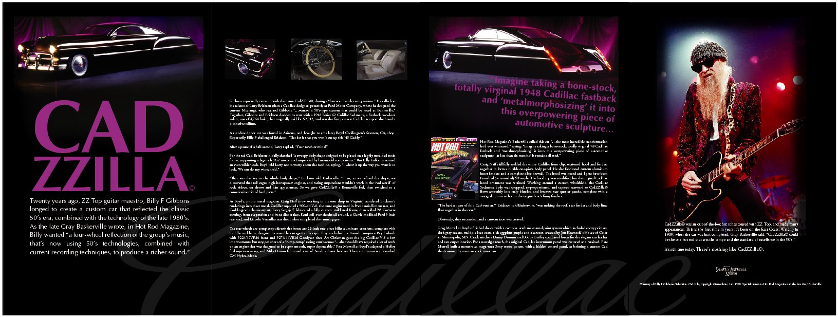
Overview: Designed the Cadillac exhibition for the Saratoga Automobile Museum in collaboration with the GM Heritage Center. Centered on the evolution of Cadillac's iconic crest, the exhibition explored the brand's rich history through a collection of significant automobiles, highlighted by Cadzilla, Billy Gibbons' legendary custom Cadillac.
Challenge: Create an exhibition that celebrated Cadillac's heritage while presenting decades of history through a cohesive visual identity that enhanced the visitor experience and respected the integrity of one of America's most iconic automotive brands.
Approach: The exhibition's visual identity was inspired by the evolution of the Cadillac crest, using its many historical variations as a unifying design element throughout the gallery. Working closely with the GM Heritage Center, I developed large-format environmental graphics, interpretive panels, vehicle identification labels, promotional materials, digital advertising, website assets, and exhibition collateral. I also planned the placement of every vehicle to guide visitor flow, ensuring ADA accessibility, appropriate viewing distances, and a clear visual hierarchy that encouraged visitors to explore the exhibition naturally.
Organization: Ensign Restoration
Role: Art Director/Designer
Deliverables: Brand Identity, Brochure, Business Cards, Letterhead, Website, Office Signage
Overview: Developed the brand identity for Ensign Restoration Services, a premier automotive restoration company specializing in award-winning concours restorations and historically significant collector vehicles. The project included logo design, brand identity, brochure, website, and business stationery, creating a cohesive visual presence that reflected the quality and craftsmanship of the work.
Challenge: Create a brand identity that honored the artistry and heritage of classic automobile restoration while distinguishing Ensign in a market where polished images of finished vehicles often overshadow the extraordinary craftsmanship behind the restoration process.
Approach: The identity balances tradition with contemporary design. A bold, lowercase e set within a shield creates a strong, modern foundation, while a winged motif references the classic automotive and aviation emblems that defined an earlier era. For the brochure, I chose to feature a single unrestored automobile as the hero image. While unconventional, it became the most compelling way to communicate Ensign's expertise. Surrounded by images of flawless collector cars, the unrestored vehicle told the more powerful story: Ensign transforms neglected automobiles into concours-winning masterpieces. That same philosophy guided the website, business stationery, and supporting brand materials, creating an identity rooted in craftsmanship, authenticity, and respect for automotive history.
Overview: A collection of identity marks created for businesses, nonprofits, products, and events. Each logo is built on a clear concept and designed to communicate with simplicity, purpose, and lasting impact.
Approach: Every logo starts with an idea. By exploring concept, typography, shape, and composition, I develop identities that are distinctive, memorable, and versatile enough to perform across print, digital, signage, and environmental applications.
Client: Saratoga Automobile Museum
Role: Art Director/Designer
Deliverables: Event Identity, Invitation, Poster, Digital Ads, Email Marketing
Challenge: Create a fundraising invitation that captured the excitement of NASCAR, encouraged attendance, and stood out as a memorable keepsake rather than a traditional invitation.
Approach
Rather than relying on a traditional invitation, I designed an interactive package that transformed the event materials into a collectible piece. Four die-cut racing tires guided recipients through the invitation, RSVP, table reservation, and autograph card, while a translucent envelope offered a preview of the concept before it was opened.
Solution: A four-piece invitation package featuring die-cut racing tires that included the event invitation, RSVP, table reservation, and autograph card, all housed in a translucent envelope that previewed the concept.
Organization: Saratoga Automobile Museum
Role: Art Director/Exhibition Designer
Deliverables: Exhibition Identity, Environmental Graphics, Interpretive Panels, Vehicle Identification, Visitor Experience, Marketing Collateral, Web Assets
Overview: Designed the Cannonball Run exhibition for the Saratoga Automobile Museum, celebrating the life of automotive journalist Brock Yates and the legendary cross-country race that inspired one of motorsport's most enduring stories. The exhibition featured original Cannonball Run vehicles alongside artifacts and memorabilia that explored Yates' legacy and the cultural impact of the event.
Challenge: Create an exhibition that captured the irreverent spirit and adventure of the Cannonball Run while presenting its history through an engaging visitor experience that balanced storytelling, automotive heritage, and memorable visual design.
Approach: Building on the Cannonball Run's established identity, I developed a visual system that embraced the energy and personality of the race. The iconic road-and-setting-sun logo served as the foundation, while supporting graphics incorporated recognizable symbols of the journey from New York to California, including the Statue of Liberty and palm trees. I designed the exhibition's environmental graphics, interpretive panels, vehicle identification labels, promotional materials, digital advertising, website assets, and exhibit collateral. Every vehicle was thoughtfully positioned to guide visitor flow, with ADA accessibility, viewing distances, and clear visual hierarchy informing every aspect of the gallery experience.
Client: Nacre Dance Company
Role: Designer, Photographer
Deliverables: Photography, Art Direction, Poster Design, Print Production
Overview: Commissioned by Nacre Dance Company, this poster combined original photography and design to create a striking promotional piece celebrating movement, architecture, and the character of Saratoga Springs. The finished artwork was later offered as a framed fine art print through Crafters Gallery.
Challenge: Create a memorable promotional image that captured the grace and artistry of dance while using Saratoga's architecture as an integral part of the visual story.
Approach: The concept centered on a single photograph. A dancer framed by cascading flowers on a historic fire escape became the focal point of the composition as her flowing dress caught the breeze, creating a sense of movement and elegance. The poster design remained intentionally restrained, allowing the photography to speak for itself. A simple typographic treatment paired with the line "Escape to Saratoga" created a subtle play on words that complemented the image without distracting from it.
Organization: Saratoga Automobile Museum
Role: Art Director /Exhibition Designer
Deliverables: Exhibition Identity, Environmental Graphics, Interpretive Panels, Vehicle Identification, Visitor Experience, Marketing Collateral, Web Assets
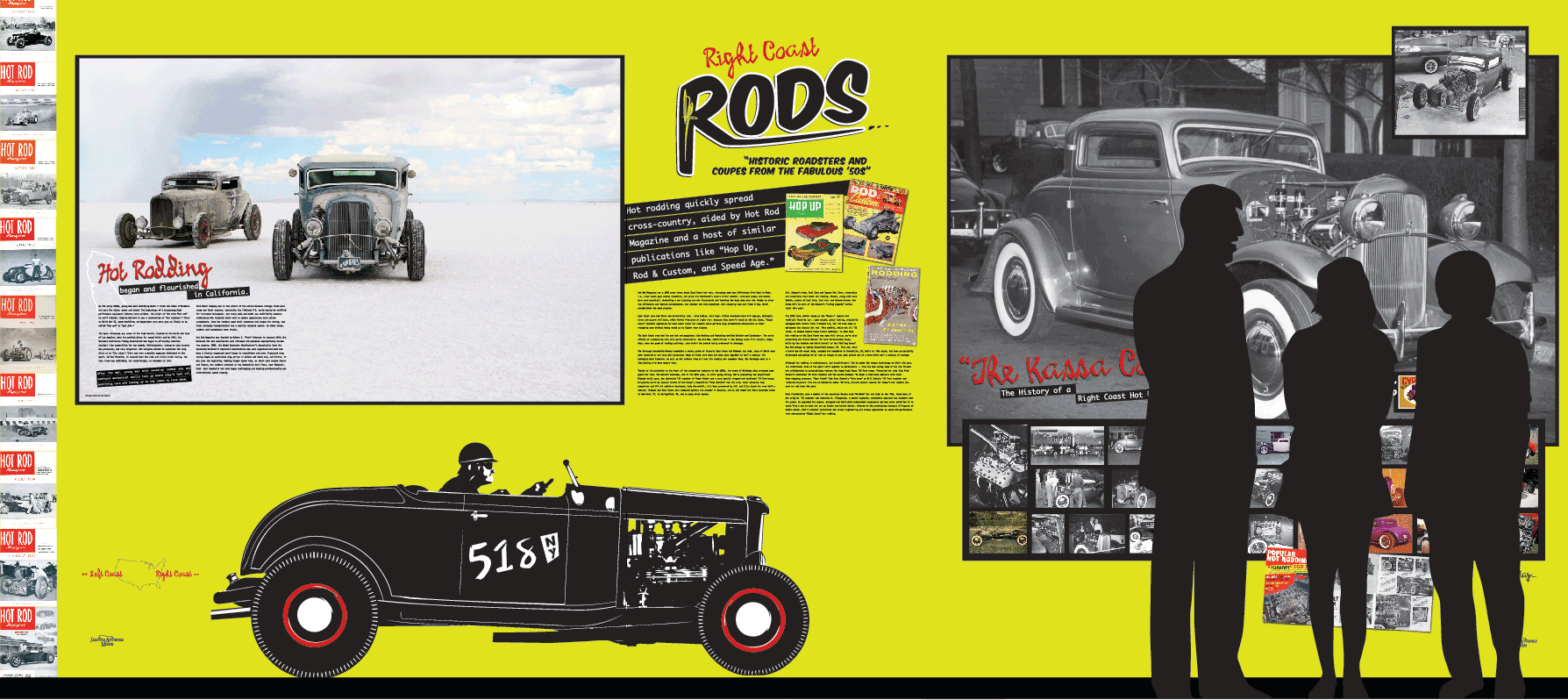
Overview: Designed the visual identity and exhibition graphics for Right Coast Rods, an exhibition celebrating the ingenuity, craftsmanship, and culture that gave rise to the American hot rod movement on the East Coast. Featuring historically significant vehicles and personal stories, the exhibition explored how a generation of returning World War II veterans transformed their engineering skills, creativity, and passion into one of America's most influential automotive subcultures.
Challenge: Create an exhibition that celebrated more than the cars themselves. The experience needed to honor the people behind them, weaving together personal histories, technical innovation, and cultural significance into a visual narrative that reflected the spirit of hot rodding.
Approach: The exhibition identity was inspired by the bold optimism and handcrafted character of early hot rod culture. Vintage-inspired typography, rich color, and expressive graphics established a visual language that celebrated the era while supporting the stories behind each vehicle. I designed the exhibition identity, environmental graphics, interpretive panels, vehicle identification labels, promotional materials, digital advertising, website assets, and exhibit collateral. Every vehicle was thoughtfully positioned to guide visitor flow, with ADA accessibility, viewing distances, and clear visual hierarchy shaping the overall visitor experience.
Organization: Saratoga Automobile Museum
Role: Art Director • Designer
Deliverables: Event Identity • Poster • Postcards • Tickets • Web Assets
Overview: Developed the visual identity for Beer & Burgers, an annual fundraising event for the Saratoga Automobile Museum celebrating craft beer, great food, classic automobiles, and the local community. The branding established a playful, energetic personality that reflected the casual atmosphere of the event while helping drive attendance and support the museum's fundraising efforts.
Challenge: Create a memorable event identity that balanced the excitement of craft beer, local restaurants, and automotive culture while appealing to a broad audience and standing out across print and digital promotions.
Approach: The identity centered on a custom illustration of a classic burger and pint of beer framed by hops and set against a bold red checkered background, a visual nod to motorsports that tied the event back to the museum. Bright colors, expressive illustration, and playful typography created an approachable personality that carried consistently across posters, postcards, tickets, and digital marketing materials. The result was a cohesive campaign that captured the fun, community-focused spirit of the event while reinforcing the museum's brand.
Client: Saratoga Performing Arts Center (SPAC)
Role: Designer
Deliverables: Invitation, RSVP Suite, Print Production, Digital Assets
Overview: Designed the invitation suite for the Saratoga Performing Arts Center's New York City Ballet Gala, themed A Gatsby Evening. Inspired by the elegance and sophistication of the 1920s, the invitation established the visual identity for the event while reflecting the artistry of ballet and the glamour of the Gatsby era.
Challenge: Create an invitation that balanced the timeless elegance of ballet with the style and sophistication of the Roaring Twenties, while establishing a memorable first impression for one of SPAC's premier fundraising events.
Approach: The cover featured a vintage-inspired illustration of a 1920s soirée, opening to dramatic grayscale photography of a ballerina. Typography flowed gracefully through the figure, guiding the eye and reinforcing a sense of movement throughout the piece. The design relied on a clean palette of turquoise, black, and white, allowing the vintage illustration and expressive photography to take center stage. The visual identity extended across the invitation suite, RSVP materials, and supporting digital assets, while production decisions carefully balanced premium finishes with budget and timeline requirements.
Organization: Saratoga Race Course
Role: Designer
Deliverables: Exhibition Identity • Environmental Graphics • Large-Format Graphics • Interpretive Panels • Site Signage
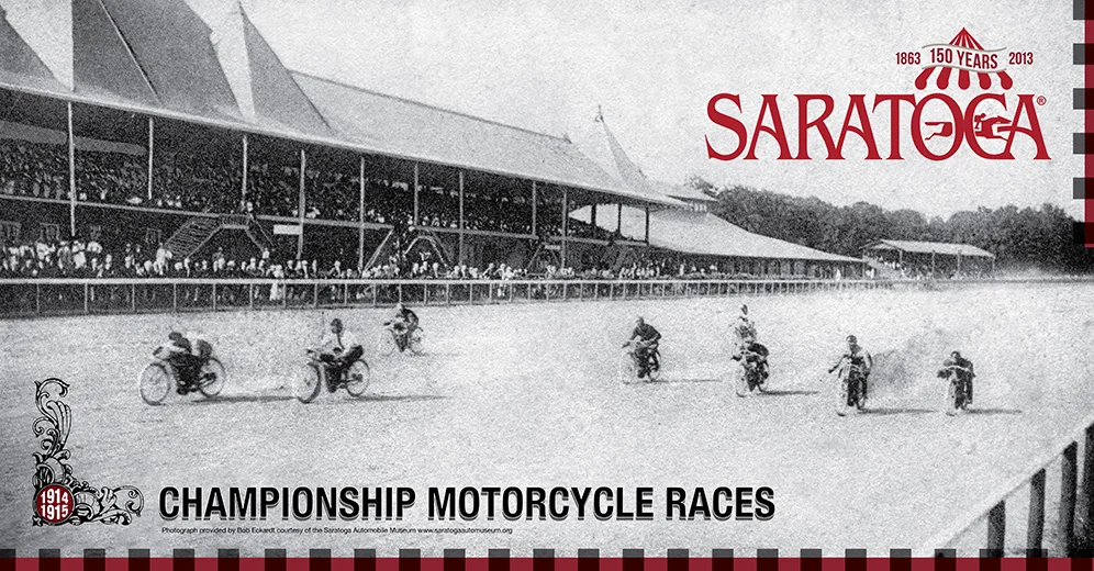
Overview: Designed a commemorative exhibition celebrating the 150th anniversary of Saratoga Race Course, honoring one of America's most historic sporting venues through a series of large-format environmental graphics installed throughout the grounds. Blending archival photography with contemporary design, the exhibition connected visitors with Saratoga's rich history while complementing the character of the race course itself.
Challenge: Celebrate 150 years of Saratoga history through a visual language that respected the site's architectural heritage while feeling engaging and relevant to today's visitors.
Approach: The exhibition identity was built around a decorative motif inspired by the ornamental detailing found throughout Saratoga Race Course's historic grandstand. Archival black-and-white photography was paired with bold geometric framing elements that created a contemporary interpretation of traditional photographic negatives, balancing heritage with modern graphic design. Installed as site-specific environmental graphics throughout the grounds, the exhibition was designed to integrate seamlessly with its surroundings while encouraging visitors to pause, reflect, and experience Saratoga's history in a new way. Originally created for the anniversary exhibition, the large-format panels were later repurposed as permanent environmental graphics throughout the Saratoga Race Course grounds, extending the life of the project and continuing to connect visitors with the site's rich history.
Client: Warden & Company
Role: Designer
Deliverables: Logo, Brand Identity, Marketing Collateral, Merchandise, Digital Assets
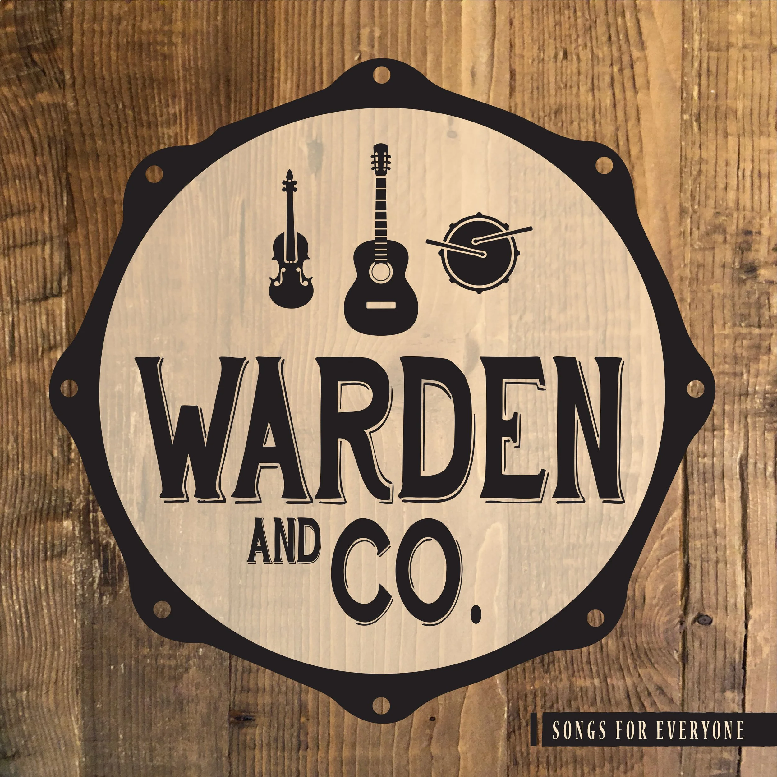
Overview: Developed the visual identity for Warden & Company, creating a timeless brand that reflects the band's acoustic roots, craftsmanship, and authentic approach to music. The identity was designed to perform seamlessly across print, merchandise, promotional materials, and digital platforms while establishing a memorable presence for the group.
Challenge: Create a brand identity that reflected the band's honest, handcrafted sound while standing apart in a crowded music landscape. The identity needed to feel timeless, versatile, and authentic without relying on trends or visual clichés.
Approach: The identity centered on a simple emblem inspired by the instruments that define the band's sound. An acoustic guitar, fiddle, and drum were arranged within the circular form of a drum head, creating a balanced mark that symbolized the group's collaborative nature. A classic serif typeface reinforced the warmth and tradition of acoustic music, while a restrained palette, natural textures, and handcrafted details created a visual language rooted in authenticity. Together, these elements established a cohesive identity that communicates musicianship, craftsmanship, and timeless appeal across every application.