

Client: Warden & Company
Role: Designer
Deliverables: Logo, Brand Identity, Marketing Collateral, Merchandise, Digital Assets
Overview: Developed the visual identity for Warden & Company, creating a timeless brand that reflects the band's acoustic roots, craftsmanship, and authentic approach to music. The identity was designed to perform seamlessly across print, merchandise, promotional materials, and digital platforms while establishing a memorable presence for the group.
Challenge: Create a brand identity that reflected the band's honest, handcrafted sound while standing apart in a crowded music landscape. The identity needed to feel timeless, versatile, and authentic without relying on trends or visual clichés.
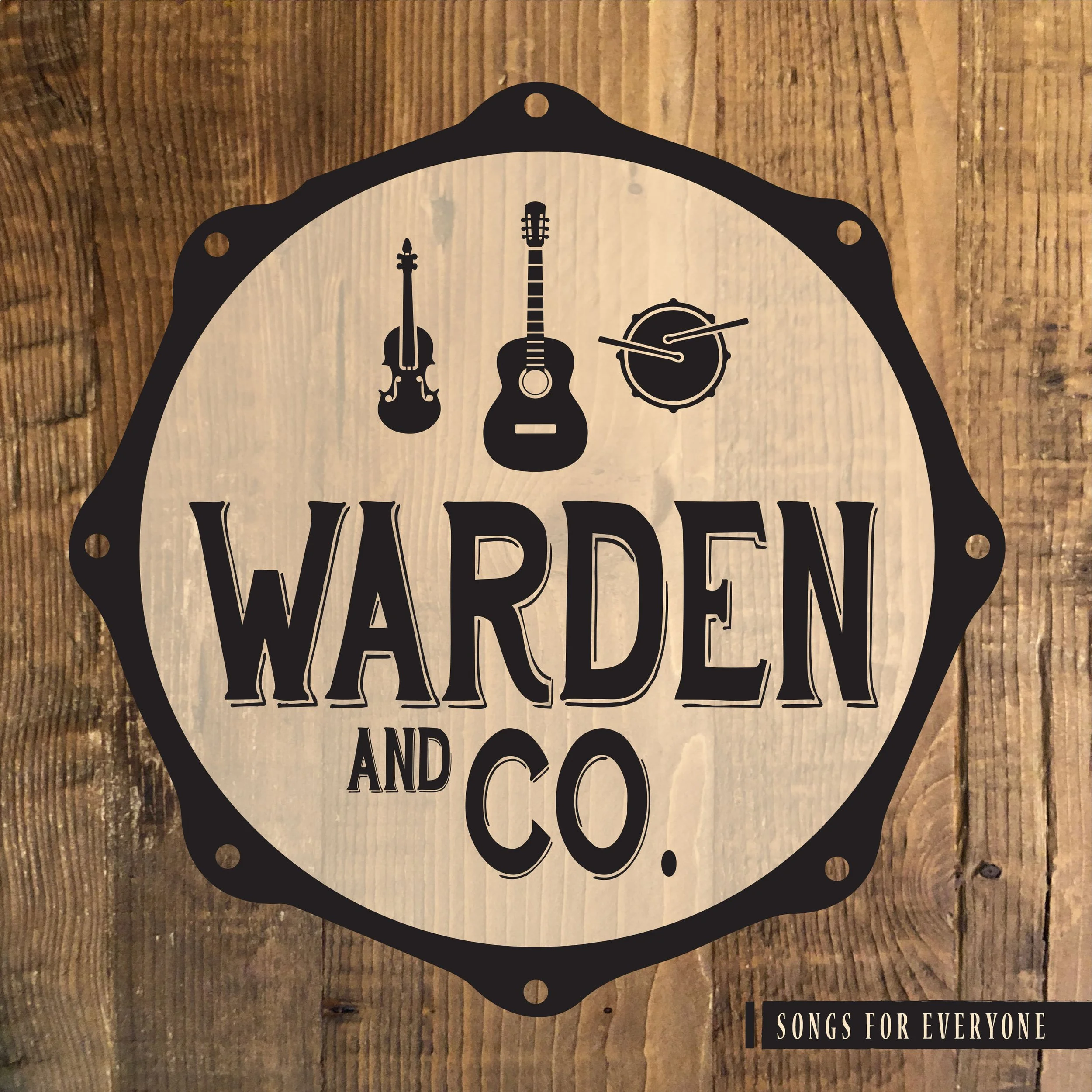
Approach: The identity centered on a simple emblem inspired by the instruments that define the band's sound. An acoustic guitar, fiddle, and drum were arranged within the circular form of a drum head, creating a balanced mark that symbolized the group's collaborative nature. A classic serif typeface reinforced the warmth and tradition of acoustic music, while a restrained palette, natural textures, and handcrafted details created a visual language rooted in authenticity. Together, these elements established a cohesive identity that communicates musicianship, craftsmanship, and timeless appeal across every application.